This is How and When to Re-Optimize Your Amazon Listing


Table of Contents
Considering how fast Amazon’s competitive landscapes change, maintaining the upkeep of your listing’s yard can be one of the most rewarding things you can do to amplify the success of your business on the platform.
With millions of sellers and products available on Amazon, reoptimizing your Amazon listings can make the difference from ensuring your listings are visible and appealing to your potential customers to hijacking sales from your competitors.
But… how exactly do you know it is time to optimize your listing?
I recently sat down with Emma Tamir, CEO and Founder of Marketing By Emma, to pick her brain on when and how one should go about product listing page makeovers.
She stated one side of it is data and the other side of it is the listing itself. “If you are in the midst of launching, you might not necessarily have the data from a product performance perspective, but you should still be considering all of these other aspects.”
How “well optimized” something extends well beyond what the character length is and whether or not all the crucial fields are filled out. It is inclusive of understanding the quality of the images, bullet points, and description you are using, how you are diversifying the different types of A+ content that are available to you, and how effectively you are using them.
For you to have a better understanding, let’s break down all of the moving pieces that Emma’s agency has seen to be effective in working with clients over time.
Keep in mind this method can still prove beneficial if your product launch is imminent and you are trying to figure out how to position your product in a way that can be advantageous and competitive against the other products that are already being sold in your category.
Data Points
First, when reoptimizing your listing, you should really be doing some preliminary keyword research and even considering how those keywords contribute to a larger picture be it new trends, seasonality, and aesthetics. Then, gauge your search query performance. The Helium 10 suite of tools is robust with information it provides to sellers such as the performance of different keywords, page, and session views, conversion rates, and more.
Emma and I chose to analyze and repurpose two listings, the stackable egg rack and coffin-shaped mirror, for the sake of leading by example.
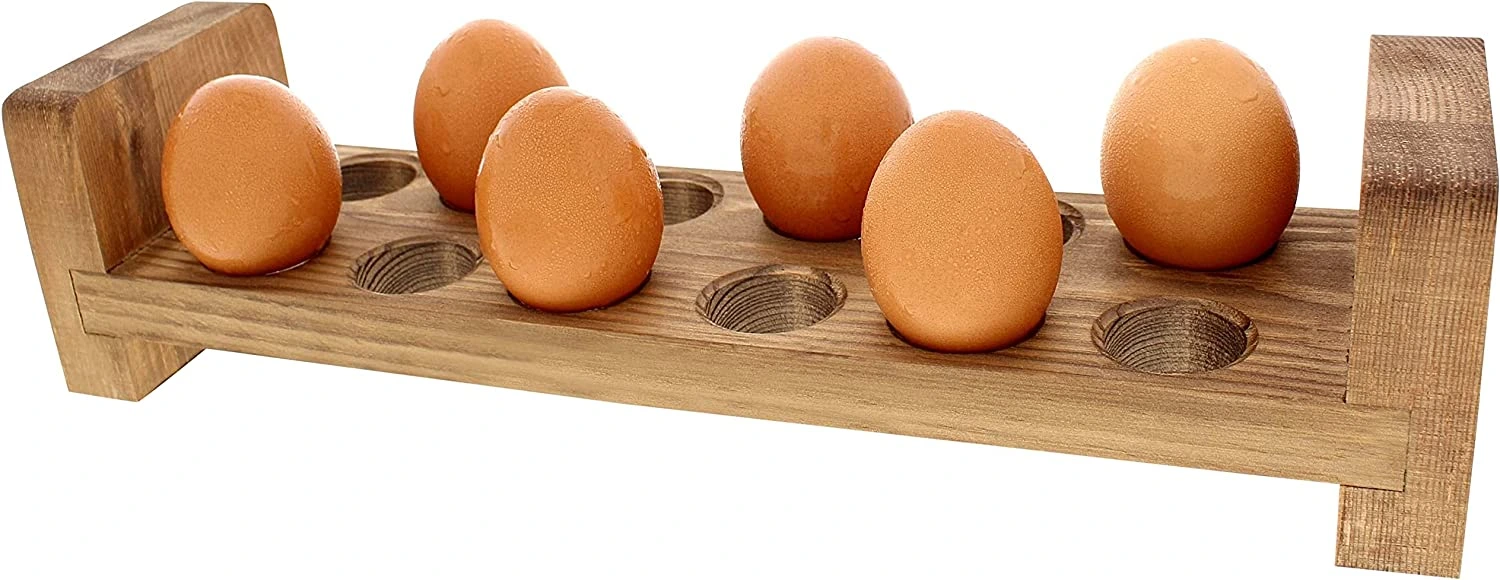

Both products have listings that are heavily keyword-stuffed and lack positioning. In regards to the coffin-shaped mirror, though seasonal and Halloween-centric keywords like haunted house decor or Halloween decorations may not be something we want to lean into as they wax and wane throughout the year in terms of popularity, we can stay cognizant of newer trends. We could focus on witchy decor as an aesthetic since the McAddams family launch on Netflix may have brought it into general play.
Moving past that, by analyzing competitor performance via their product ranking on different terms, we stand to find opportunities perhaps the others are missing that we may want to target.
Emma thinks of optimization as an active thing that you are doing. It is not something that you do and then you are simply done.
Depending on the category you are selling in and how well your listings are converting, you will want to update the elements of your Amazon web pages. Make it a point to stay current with your copy and creatives as it is the equivalent of how you would transition decor in the case of owning a physical store. Keeping winter decorations up when it is summer can be unappealing as it showcases a lack of care.
Functionality
The opposing end of the spectrum for optimization is when did you create your listing? Is it up to date with the functionality of the platform? If you have extended your product line or Amazon has added new features, it is in your best interest (as well as your prospective buyers) to refurbish and take advantage of them.
Things like standard comparison charts that incentivize cross-selling or upselling, crafting a compelling brand story to spotlight trust, and utilizing all 12 pieces of potential free A+ content that have been approved can allow you a leg up on your competition. That goes to say if you suddenly have access to a privilege that previously was only available to an elite few – why would you want to pass that up?
As Emma puts it, “Amazon is continuously finding new carrots to dangle in front of sellers to invest into branding that people are excited to buy from and can trust.”
So invest in your own branding. Leverage the new features the platform provides.
Uplifting Your Copy and Images
Part of branding is certainly your brand story, your customer reviews, seller reviews, and staying engaged by listening to the feedback you are receiving about something your customers don’t understand or are unhappy about. However, your copy is not just about the attributes and benefits your products have. It is also the chance for you to include keywords that can help you rank and address those complaints or concerns more upfront. Read your customer reviews frequently. Customer reviews are an insight into what to address better that is not actively being expressed in either your listing or your competitor’s listings. Get more granular in your framing or just do a better job of speaking to the right people who have a need for the product. Repelling the wrong people can mitigate negative feedback.
For other coffin-shaped mirrors in our market, some complaints were the mirror was arriving broken. Can you imagine ordering the product as a gift?
Happy Birthday here’s SEVEN years’ worth of bad luck. YIKES!
You can shoot yourselves in the foot if you assume people will read your listing. They’ll skim some part of it but likely not the entire product page.
Oftentimes, we have set criteria we are thinking about – the dimensions, displaying the coffin mirror as a hanging item, or a propped-up one. Those are likely main considerations outside of quality, but make that info easy for them to find and ask yourself: “What else?”
Then you can sell the product well leading into Amazon’s flywheel. The more conversions you make, the more positive customer experiences you provide, the fewer returns you will have, and the better positioned you are to sell more and more.
A great tip Emma provided is to go into your listings and look at each element as a standalone piece of content.
If you were the consumer and you were looking at only your images, only your A+ content, or just your bullet points or just your description, would you have enough information to make an informed purchase and be excited about buying the product?
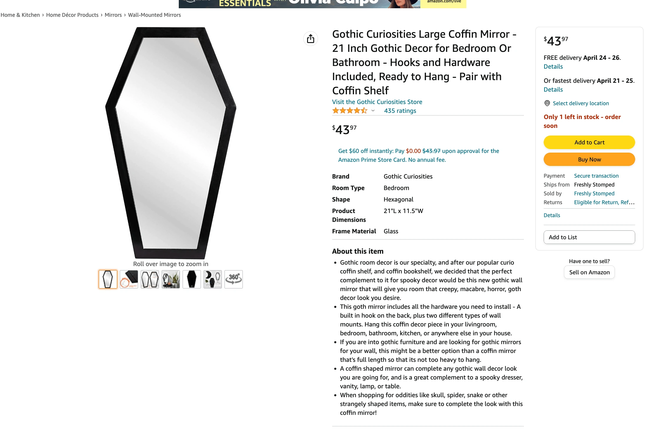

Looking at the egg holder and coffin-shaped mirror, the answer to that question is no. The images are nice but only provide partial information. What the images should do is essentially summarize the listing with all of the necessary, important information, emotional appeals, and benefits of why the product is great. In turn, your written information will become impactful paired with those stronger images.
By realizing more people are shopping on mobile, you also begin to acknowledge just how primed people are to engage with information in a social content kind of way. You have a few seconds to make an impact. For a brief period of time, Amazon was even beta testing scrollable images on the search results page meaning if you had really awesome images, someone would not have to click on your product page to make a purchasing decision. That is absolutely something worth being prepared for down the road.
Even if it never comes, the fact of the matter is a lot of people spend time scrolling images to make their decisions so the better equipped your listing is for that, the easier it becomes to generate sales.
Take a look at the 4th image of the egg rack.
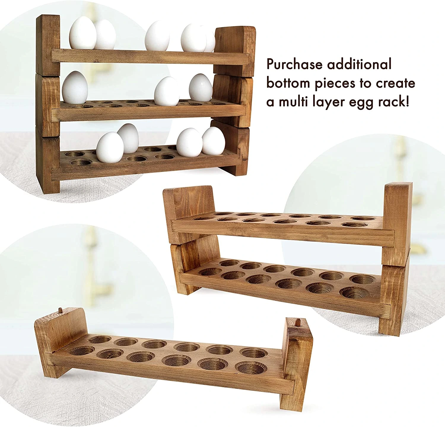
It displays pegs for the trays to stack together, but no real callout to this detail of the racks. When Emma was analyzing this listing, it was not obvious to her unless she zoomed in. Though certain attributes of your product may be obvious to you, we need to remain cautious that we are not unintentionally making assumptions about the level of effort a customer would input to understand our products.
Even if they do understand the means of stacking, then the question may become “Is this stable? If I am stacking eggs on it, what if it’s just a disaster waiting to happen?” Become intentional about catering to each aspect of your product page to facilitate understanding and appeal – both visually and textually.
Incorporating Lifestyle Images
Studies actually show lifestyle images result in an increase in engagement. People spend longer looking at images with a human touch – can even be just a hand or arm holding the product. Think outside the box to help people visualize how your product will integrate into their lives.
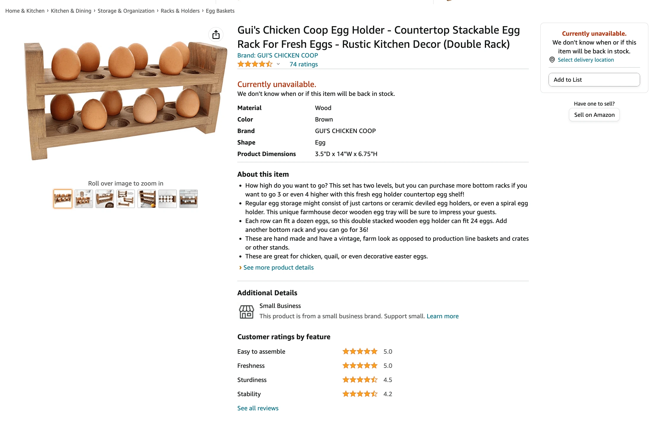
For the egg rack, some examples Emma recommended include a child moving eggs onto the rack from a basket of fresh eggs almost as if finishing up a morning chore, and people grabbing deviled eggs from the rack on an Hors D’oeuvres table. Approach it as a customer – what would I like to see and what would get me excited?
Maybe our egg rack customers do not have backyard chickens but they like the idea of going to the Farmer’s Market or having a backyard chicken for the desired farm-to-table food. A lot of marketing is building content geared towards where the person is and helping them transition to an aspirational idea of things.
I want to have chickens.
OR
I want to host a rustic-themed party.
Maybe the goal is not to have them immediately associate it to healthy lifestyle choices but to persuade them to is the next step. So when you are positioning the benefits in your images and listing content, that is the depth and level you will want to go.
As Emma puts it, “Maybe you are curious about why someone would want to stack their eggs on the countertop to begin with. Is it to remind people they should grab eggs instead of a pop tart in the morning or help them recognize and remember they have fresh eggs that don’t need to be refrigerated? What does it mean about them? Are they more interested in sustainability and environmental things or is it coming from a health and lifestyle place? The deeper you go, the more compelling it’ll be.”
In Conclusion
Do not fear thinking too deeply about your listing. Of course, what you say, how you frame it, and what you present will influence whether someone will buy your product or not, but designing a positive customer experience will far outweigh the impact of any of the other factors where you lack control.
Yes, elements like keywords are essential. However, figuring out where to place those keywords and letting them make sense as opposed to keyword-stuffed content (which is what is happening for both egg holder and coffin mirror right now) also holds equity in your listing.
With that said, go back into your listings and see if your own products are in need of a revamp! Emma and I will be updating the egg rack and coffin-shaped mirror listings and keeping you posted on how those key performance indicators change soon!
I’ll catch you there!
Achieve More Results in Less Time
Accelerate the Growth of Your Business, Brand or Agency
Maximize your results and drive success faster with Helium 10’s full suite of Amazon and Walmart solutions.
