How to Have Amazon Listing Images That Get Clicks


Table of Contents
- Unlock Your Main Image Potential with Helium 10
- Why Invest In Listing Main Image Optimization
- Make The Main Image Clear And Detailed
- Make The Image Larger
- Add The Crucial Details To Your Main Image
- Provide A Comprehensive View Of Your Product
- Highlight Product’s Key Points
- Use Appropriate Colors To Appeal To Shopper’s Emotions
- Warm Up Your Sales with the Power of Color
- Incorporate Colors In Your Main Image
- Show The Product In a Clear Context
- Connect with Shopper Needs Through Your Main Image
- Humanize Listing Images
- Include Informative Captions
- Add Keyword To Main Image
- Amplify The Value Proposition of Your Product In The Main Image
- A/B Test Your Main Image Versions
- Key Indicators Your Main Photo Needs an Update
- CTR Market Share % vs. Impression %
- CTR Market Share % vs. Add to Cart %
- Overall Conversion Rate
- Realize Your Product's Full Potential
Many Amazon sellers underestimate the power of a great main image. It can make or break your click-through rate.
Imagine this: You’ve identified a hot-selling product, crafted a killer listing with perfect keywords, and even built a captivating brand story with A+ content.
Sounds like a recipe for Amazon success, right? Wrong.
Sales are lagging, and your projected profits are nowhere in sight. What’s the culprit?
It’s highly likely your main image (and maybe the entire image set) needs a serious makeover.
So, how do we turn those blah main images into beauties that get clicks? Buckle up, we’re about to transform your listings!

Outclass Your Competitors
Achieve More Results in Less Time
Maximize your results and drive success faster with Helium 10’s full suite of Amazon and Walmart solutions.
Sign Up for FreeUnlock Your Main Image Potential with Helium 10
You’ve got the vision, now it’s time to elevate your main image optimization with the right tools! Helium 10’s suite of powerful tools helps you transform your listings into click magnets.
With Helium 10’s Listing Analyzer, you can ensure your main image meets Amazon’s requirements and stands out from the competition. Frankenstein helps you craft the perfect product title, while Scribbles optimizes your product description and bullet points. And Magnet reveals top-performing keywords to boost your product’s visibility.
By combining these tools with the main image makeover strategies we’re about to dive into, you’ll be well on your way to creating listings that drive sales and dominate the competition. Let’s get started on the main image makeover that will take your Amazon business to the next level!
Why Invest In Listing Main Image Optimization
The shopping journey on Amazon starts when a shopper enters a search term in the Amazon search bar for the product they’re seeking.
Once they hit enter, a list of products matching that search term appears.
The shopper is most likely to click on the listing with the most appealing main image.
Online shoppers can’t physically touch products, so high-quality photos are essential. That first image, the hero shot, is especially important.
Think of it as a window into your product. Studies show clear, detailed photos are key to reducing buyer uncertainty. The more informative your main image is, the easier it is for shoppers to understand the design and quality, ultimately leading to a higher chance of them clicking “add to cart.”
This is especially true for pricier items where showcasing intricate details can convince customers of the product’s value.
Make The Main Image Clear And Detailed
Make The Image Larger
The study linked above shows that larger product images garner more likes, as they allow customers to inspect the product more thoroughly. High-quality, detailed photos help customers appreciate the product and make informed purchasing decisions.
This level of detail reduces uncertainty and boosts customer preference for clear and organized images. Consequently, well-organized and informative product photos are more likely to attract customers and influence their buying decisions.
Add The Crucial Details To Your Main Image
Using larger images allows shoppers a bigger view of the product’s label. However, not all the important product information is on the label.
How do you add these to the main image? By adding a badge, a tag, or an image of the main ingredient.
Let us look at some examples:
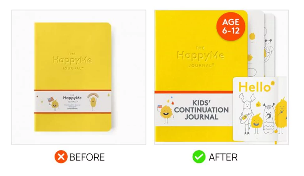
Original Main Image:
● Basic product shot of the yellow journal on a white background.
● Standard image similar to the majority of main images on Amazon.
Improvements Made:
● Displayed what the inside of the journal looks like.
● Added a sticker with a small note indicating the journal’s intended age bracket.
● Placed a large text on the front of the journal with a short description of the product.
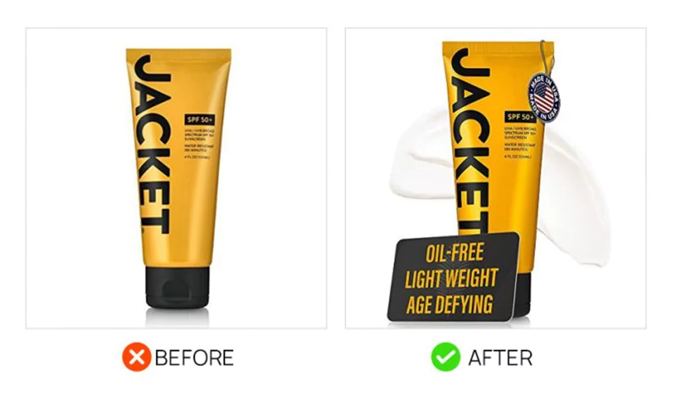
Before: The original main image for this sunscreen brand featured a plain product shot with no additional information.
After: The revamped image now includes a product information card listing three key features, a ‘Made in the USA’ tag, and a streak of cream behind the product, providing a more detailed and realistic representation.
Provide A Comprehensive View Of Your Product
Highlight Product’s Key Points
Make sure your main image offers a thorough look at your product by highlighting its key points. Show the product from multiple angles, include close-ups of important features, and add text overlays or additional elements to emphasize standout details.
This comprehensive approach not only attracts customers but also helps them make informed purchasing decisions, boosting your conversion rate.
Example:
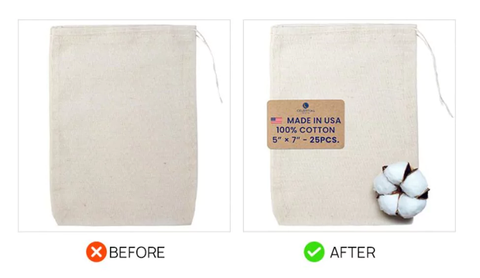
Before:
● Basic product image lacking visual interest.
After:
● Inclusion of Brown Tag that clearly states the dimensions, quantity per order, material, and “Made in USA”.
● Cotton Boll Addition for highlighting 100% cotton material for added appeal and authenticity.
Use Appropriate Colors To Appeal To Shopper’s Emotions
Warm Up Your Sales with the Power of Color
Science says that colors have an impact on people’s buying decisions. And, in the study mentioned above, it was found that photos bathed in warm colors like sunshine yellow or calming orange get more likes.
Why? Because these colors subconsciously trigger positive emotions, making customers happier and more likely to click “buy.” Think of it as sunshine for your sales! It builds on existing research linking colors to emotions, proving that surrounding your product with happy hues is a smart strategy.
Incorporate Colors In Your Main Image
In the kid’s journal above, notice that the added sticker was in red while the journal is in yellow. The color contrast makes the additional product information more prominent and noticeable to the shoppers.
If you are offering products that vary in color, you can follow the idea presented in the image below. The plain hang tag in the original image was replaced with one with color swatches of the product variations.
This move not only made the image more appealing but also helped shoppers in their decision-making.
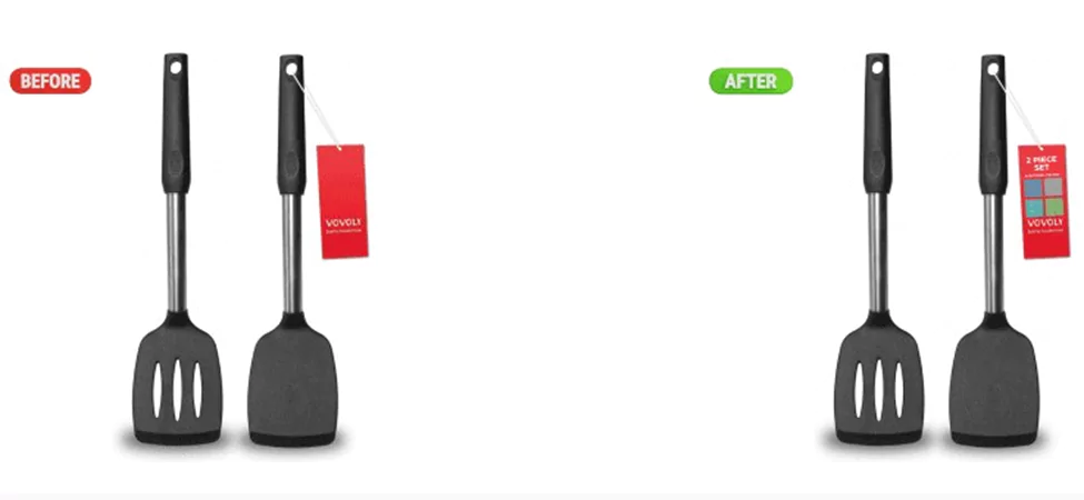
Show The Product In a Clear Context
Connect with Shopper Needs Through Your Main Image
Your main image isn’t just a visual—it’s your first conversation with potential customers. A generic image might miss the mark on their specific needs and preferences.
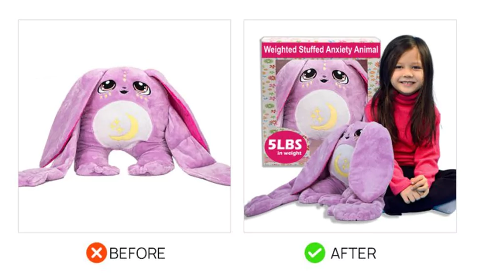
Example: Weighted Stuffed Animal for Anxiety
● Added Toddler for Scale: Clearly illustrates the product’s size and who it’s intended for.
● Improved Packaging Display: Highlights the product’s weight and features through enhanced packaging visuals, providing crucial information upfront.
Humanize Listing Images
Enhance your listing images by incorporating a person or animal model, like in the sample image above.
Adding a model not only provides scale and context but also humanizes your product, making it easier for potential customers to envision themselves using it.
This approach helps create a connection and boosts engagement, ultimately improving your chances of making a sale.
Include Informative Captions
Add Keyword To Main Image
Why add the keyword to your main image?
● Visibility: Makes your product stand out in search results.
● Instant Recognition: Helps shoppers quickly identify the product.
● Trust: Provides clarity and reduces uncertainty.
● CTR Boost: Attracts more clicks, improving organic rankings.
Here is a video to show you how:
Amplify The Value Proposition of Your Product In The Main Image
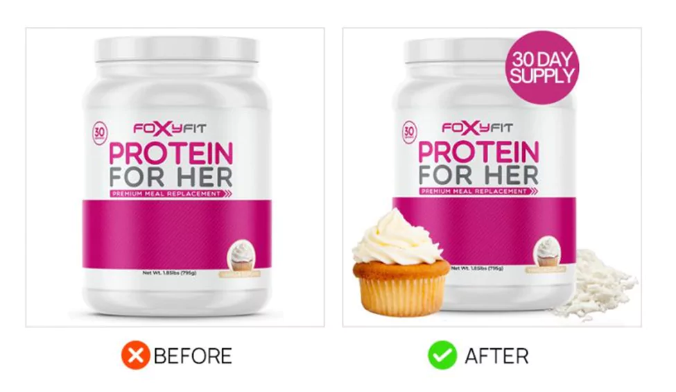
Protein powder products often look similar across brands. To stand out, this example showcases the addition of a badge highlighting its 30-day supply, a mound of the powder, and a cupcake image to indicate flavor.
These changes helped amplify the product’s value proposition, making it more appealing and distinct, which led to increased interest and sales.
A/B Test Your Main Image Versions
A/B testing lets you discover which main image gets the most clicks (CTR) for your product. Here’s the lowdown:
● Create multiple main image variations. Think of different backgrounds, close-ups, or lifestyle shots.
● Amazon Seller Central A/B Testing:
1. Log in to Seller Central
2. Navigate to Brands > Manage Experiments.
3. Click “Create a New Experiment” and choose “Main Image.”
4. Follow the prompts to set up your test, including ASIN, duration, and start date.
5. Upload your alternative image to go head-to-head with your current main image.
Services like PickFu can help you gather feedback on different image options from real people. This can add valuable insights to your A/B testing process.
With A/B testing, you can ditch the guesswork and pick the main image that truly resonates with your target audience, skyrocketing your clicks and conversions!
Key Indicators Your Main Photo Needs an Update
CTR Market Share % vs. Impression %
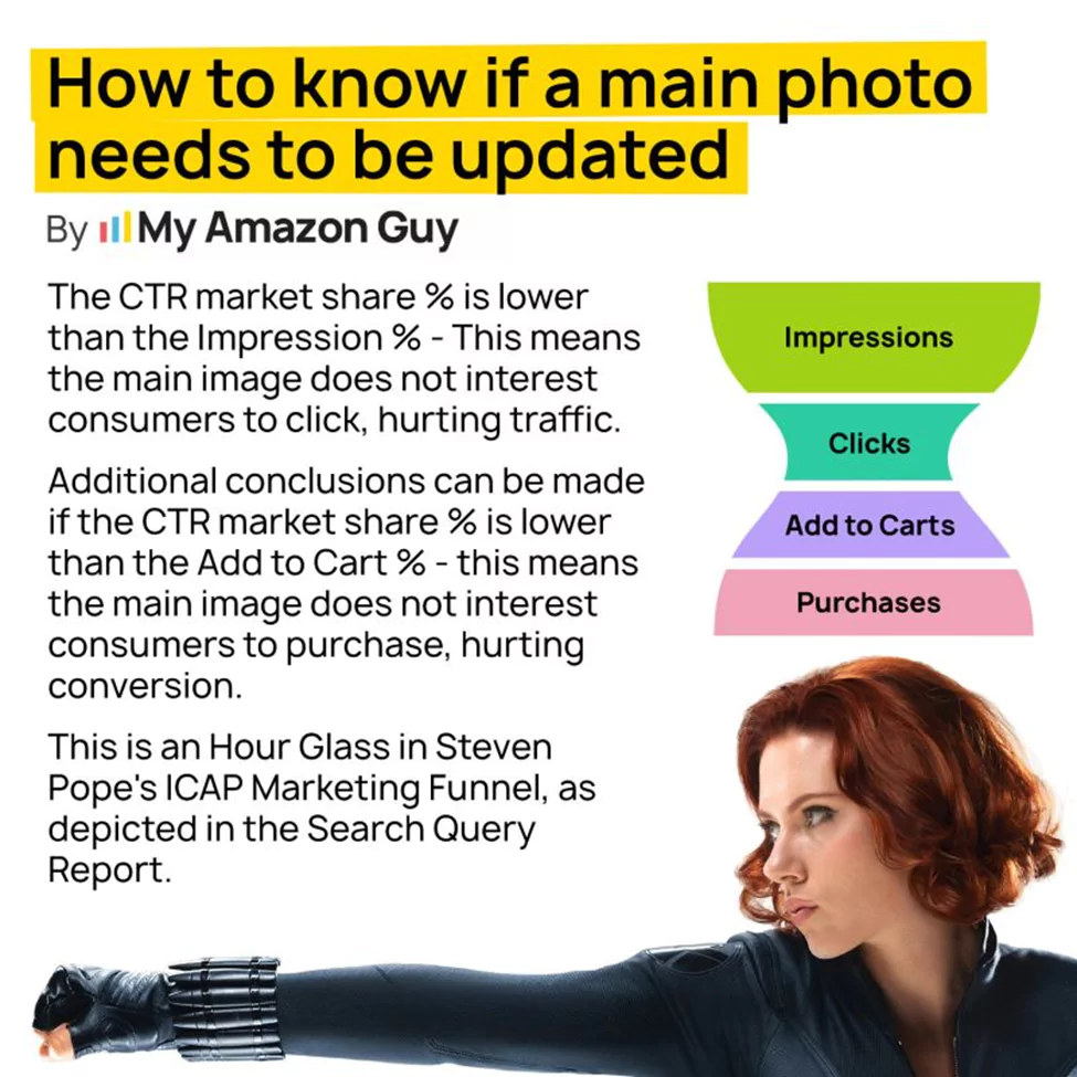
● CTR (Click-Through Rate) Market Share is the metric that indicates the percentage of customers who click on your product after seeing it.
● Impression % is the percentage of customers who see your product image in their search results.
● Analysis: If your CTR market share is lower than your impression %, it means that while your product is being seen, it isn’t compelling enough to click on. This gap suggests that your main image isn’t capturing the interest of potential customers, and updating it could significantly boost your traffic.
CTR Market Share % vs. Add to Cart %
● Add to Cart %: shows the percentage of customers who add your product to their cart after clicking on it.
● Analysis: If your CTR market share is lower than your add to cart %, it means that your product description and additional images are convincing, but the main image isn’t. This indicates that the main image might be misleading or not enticing enough, thus requiring an update to align better with your product’s strengths.
Overall Conversion Rate
● Conversion Rate is the percentage of customers who purchase your product after adding it to their cart.
● Analysis: If you notice a significant drop-off from add to cart to purchase, the issue might not be with the main image but could be related to price, reviews, or other factors. However, if the drop-off is before adding to the cart, the main image is likely a contributing factor.
Realize Your Product’s Full Potential
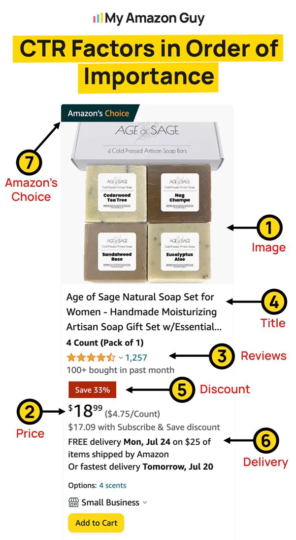
By following these image optimization tips, you’ve transformed your main listing image from a click-through dud to a conversion stud. Remember, a stellar main image is just the first course in the Amazon optimization feast. To truly dominate the search results and watch your sales soar, don’t forget to optimize other crucial listing elements shown in this image:
By tackling these optimization areas alongside your main image, you’ll create an Amazon listing that’s an irresistible magnet for clicks and sales.
Achieve More Results in Less Time
Accelerate the Growth of Your Business, Brand or Agency
Maximize your results and drive success faster with Helium 10’s full suite of Amazon and Walmart solutions.
